Who would have thought that creating the perfect Fiverr gig image in 2024 could be so frustrating? Fiverr’s recommended gig image size is anything but pixel perfect, leaving sellers to guessing games as they upload high-quality thumbnails that end up looking blurry, distorted, and stretched out. What’s going on and what is the perfect gig image size? I’ve got your back – read on.
Fiverr Suggests Three Different Gig Image Size Types
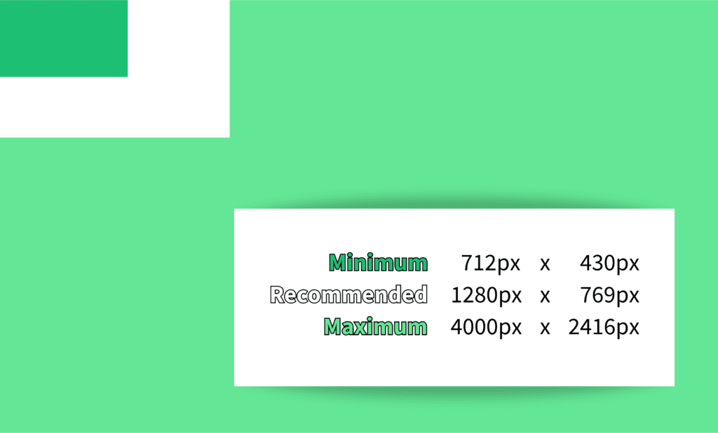
The image above shows the huge difference in Fiverr’s recommended gig image sizes. According to Fiverr, you can create an image between a tiny 712px x 430px to a massive 4000px x 2416px. So long as the image stays under 5MB, you’re good to go, right?
Actually, no, you’re very far from good to go unless you get lucky.
The problem?
Fiverr doesn’t use consistent aspect ratios in its recommendations or the many resizes it uses across its web and mobile sites. Which means cropping, distortion, and inconsistent presentation is a free bonus ? with any Fiverr-recommended gig image size.
Fiverr’s Own Free Gig Image Templates Don’t Work
This problem extends to the free gig image templates Fiverr provides, which you can edit in PowerPoint. Those templates come in the spicy 550 x 370 px flavor.
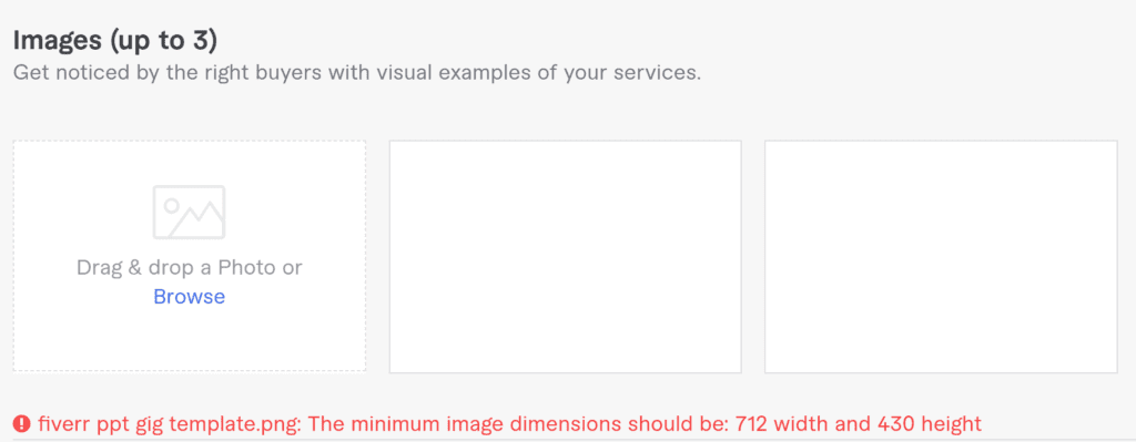
Oh.
This isn’t a tragic loss, as the templates look quite dull and outdated. They are probably a relic from the pre-coronavirus period when Fiverr recommended this gig image size. They might be good for mild inspiration, but that’s about it.
What this illustrates is that you really can’t trust Fiverr when it comes to knowing the right gig image size. Because the fun doesn’t stop there!
Fiverr’s Recommended Gig Image Designers Don’t Get It Right
Last, but not least, Fiverr has a page dedicated to sellers who have gig image creation services. This list does change, but there are almost always sellers advertising themselves with cropped-off images. Is that a seller fail or a Fiverr fail?
We will never know. What we do know is that Fiverr tells us this:
Success begins with a great Gig image
Get a professional image that captures buyer attention.
Fiverr (it do be like that tho)
This all boils down to one thing: if you listen to what Fiverr tells you to do, your gig image is going to suck. Fiverr only tells you to use a tool to resize or your Fiverr gig image or hire a gig expert to make it awesome.
But if you can only upload one size, remember that third-party resizing tools tend to resize proportionally and you have no guidelines for Fiverr’s cropping zones,.
Just what are you meant to do? Fiverr doesn’t answer this question, but the answer is an endurance event involving deep trial and error. You’re left holding a screaming baby and nursing a terrible headache. What does it want? Why won’t it shut up? Why did you think it was ever a good idea to do this in the first place?
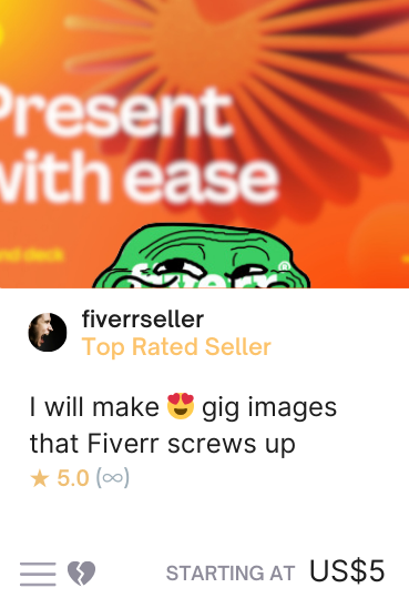
This is not a real Fiverr gig. It’s a composite of the things Fiverr can screw up when it comes to its own gig image size recommendations.
If your image is the minimum recommended size of 712 x 430 px and less than 72 DPI, it may be blurry or pixelated.
If you try a bigger gig image size, there’s a good chance any elements in the invisible dead zone will be cut off.
It could be text, it could be your face, it could be some beautiful little motif you spent more time perfecting than you’d like to admit.
When you upload it and check, yikes. What happened? Fiverr. Fiverr happened.
It’s not really surprising that many Fiverr sellers don’t bother to optimize. The gig image size system on Fiverr is a complete mess.
But I’m not other sellers. I wanted to solve this ghastly gig image size problem once and for all. Or at least until the next big resolution change comes along and screws it all up again.
Google Searches and the Canva Conundrum
Google is not a bad place to look when you have questions, but it will completely fail you here. I’ve written this blog in the hope of changing that, and hopefully you’re here because of Google.
Canva is almost always one of the top search results for people looking for the correct Fiverr gig image size. Now, I love Canva – I used it to create the gig image just above! – but unfortunately, their guide follows Fiverr’s guidelines.
? QUICK TIP FOR GRAPHIC DESIGNERS
If you’re a graphic designer looking for an untapped market, join the Canva Creators Program and make Fiverr gig templates. Lots of Fiverr sellers use Canva, and many more are looking for attractive gig images. Create, add relevant keywords, and make modest profits!
Many other websites are no better. Sometimes, the dimensions of Fiverr’s free gig image templates are given (you know, the ones that don’t work at all). In short, Google is useless here. You’re on your own, kid.
What’s a poor Fiverr seller to do if you want to make sure your gig image looks amazing, no matter what?
The Perfect Gig Image Size Considers Dead Zones
The video below demonstrates the dimensions for a Fiverr gig image size. It also includes the dead zone. The dead zone is the parts of your gig image that Fiverr’s resizing across the website chops out. It’s the no man’s land of Fiverr where brave gigs go to die in a pointless orgy of resizing issues.
If you keep everything important in the white area, your gigs are going to look exactly the same everywhere on Fiverr. The black area should still contain background elements – because larger gig resizes include that space.
Here’s John Travolta inside a perfect gig image, confused at the latest change – as he should be, because he’s now being resized by an embedded YouTube video – which does not match with Fiverr’s resizing! You’ll see the full ideal gig image size further down this article.
I’m going to show you how to optimize your gig image with the correct gig image size. Following these tips will help your gig to stand out a lot more.
Why Gig Image Size Is Important For Your Fiverr Thumbnail
First Impressions for Potential Buyers
It’s hard to overstate how important using the correct image size is on Fiverr. Your gig is the first thing potential buyers will see. It will usually be seen in a sea of competitors, so you need an image that grabs attention and makes a great first impression. If your gig isn’t optimized and using the ideal size, buyers will click on someone else’s gig.
There’s no magic to creating a great Fiverr gig image:
- Create a high-quality, attractive image
- Showcase your skills and experience
- Ensure that your thumbnail is readable
- Use the correct image dimensions
- Follow general gig image guidelines
Of course, if you follow Fiverr’s image guidelines for the dimensions, the middle step is frustrating. Using the recommended 1280 x 769 pixels under 5MB with 72 DPI should produce perfect results, but Fiverr doesn’t tell you where the dead zone starts and ends.
You really have to experiment if you want to make sure that your Fiverr gig image doesn’t look like a two-year-old vomited all over a magazine rack. I mean, there’s a good chance that your target market doesn’t like that.
Your customer journey – and consequent customer experience with you – can start and end with your gig image, so you really want to put your best foot forward here. Let other sellers give up and accept that their Fiverr gig image sucks. You can be the seller who takes the profits they could have had.
Impact of Distorted Fiverr Gig Image Size on Gig Ranking
This is pretty simple. Fiverr’s algorithm tracks a lot of things. While nobody knows exactly how it works, we know that it tracks things like impressions and clicks. The worse you perform against comparative sellers, the more likely the algorithm is to downgrade your weighting.
Or, in Fiverr seller terminology, your gig rankings get busted. You need an attractive gig image that gets the clicks that lead to sales. This isn’t a complicated point. If your gig image is blurry, distorted, or cropped, you will look more amateur than sellers who have managed to solve the issue.
That doesn’t mean you won’t get the click and sale. It does mean that gig image size impacts gig rankings and your ability to attract potential buyers. It also means that you should be very careful when using Fiverr’s own gig image size recommendations and create white space near the borders for optimized images across all devices.
Creating a Fiverr Gig Image with the Provided Guidelines Is Hard
As we know, Fiverr suggests three different gig image sizes, recommending the 1280px x 769px size in particular.
Fiverr’s Approach to Aspect Ratios Doesn’t Work
The guidelines don’t offer any real help when it comes to judging the best way to resize, nor do they inform you that the aspect ratios are all over the place. An aspect ratio is simply the relationship between the size and width of an image. A 1:1 aspect ratio is a square, while a 2:1 (or 1:2) ratio is a rectangle.
To give familiar examples, the aspect ratio of YouTube videos are set at 16:9 while TikTok videos are set at 9:16, aligning with the most common screen sizes on devices today. If you resize and keep the original image aspect ratio, your image will always look the same with some loss of quality in extreme resizes.
Sadly, Fiverr doesn’t use consistent aspect ratios, so the loss of quality exists in non-extreme resizes. None of the aspect ratios it recommends match. When the Fiverr website or app resizes an image to fit fixed image frames, the notion of consistent aspect ratios is tossed aside with gay abandon.
Which would all be fine, if you had guidelines to the best possible original image dimension along with clear instructions on dead zones. Fiverr is unusually outdated here, since many platforms these days make it easy to upload UGC that looks good everywhere you can find it on their websites and apps.
Best Practices for the Ideal Fiverr Gig Image Size

Now you understand the issues that lead to crummy gig image size issues, you can start to plan your gig images better. Image resolution and dimensions are essential for a good looking gig, but your Fiverr gig will only look amazing if you make good use of contrast, branding, and aesthetics.
Ultimately, you want to create a visually appealing image that snaps browsing buyers’ focus onto your gig image.
Understanding Image Resolution and Dimensions
To understand the best practices for the perfect gig image size, you need to start by understanding image resolution and dimensions. Image resolution refers to the number of pixels in an image, while dimensions refer to the width and height of the image.
Fiverr has specific gig image requirements and guidelines that allegedly ensure optimal visibility. The recommended gig image size is 1280px x 769px. As you know, this is a #fail.
You’re better off using 1280px x 752px with an 12:7 aspect ratio to display images properly on both search result and individual gig pages.
It’s important to create whitespace around the gig image for better visualization on mobile devices. You can do this by implementing a gig image size dead zone of 50px on the horizontal axis and 150px on the vertical axis. Here’s what it should look like.
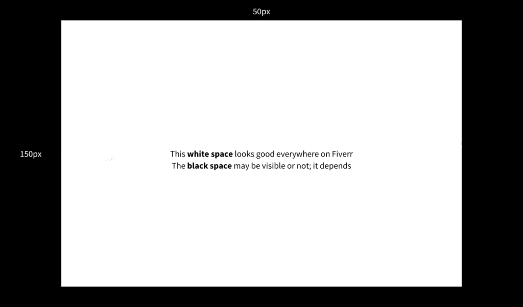
If 1280px x 752px feels cramped, you can increase it, but keep the aspect ratio consistent! Remember to stay within Fiverr’s maximum size guideline of 4000 x 2416 and maintain the 12:7 aspect ratio as much as possible to minimize gig image size distortion upsets.
Finally, make sure your gig image is no larger than 5MB or Fiverr will reject it.
The Role of Contrast, Branding, and Aesthetics
To enhance the visibility and appeal of your gig on Fiverr, you absolutely need to know a little bit about graphic design. You don’t need to be an expert. You just need to know some basics – there is plenty of inspiration on Fiverr for great gig images, too. Take a look around! Get ideas!

Contrast is a great way to make your Fiverr gig image visually appealing. Use it to help elements stand out and catch the buyer’s attention.
Contrasting colors are a great way to do this; the classic way is to use light text on a dark background or vice-versa.

If you’re not branding yourself on Fiverr, you’re missing out on sales. Branding helps give you a more professional appearance and a coherent, easily identifiable presence on Fiverr.
Make sure your gig image aligns with your brand identity and also fits into the Fiverr gig image size template.

If you already have your brand guidelines, you already know your aesthetics.
If you don’t have a brand, you can create an aesthetic that matches your gigs – if you use the perfect gig image size, your design will not be misshapen, so you’re ahead of the crowd!
Wrap Up: You Need a Perfect Gig Image Size
Fiverr is insanely competitive, which means you need to do everything you can to succeed. A gig image that looks professional and doesn’t get cut off is an easy way to get ahead of hundreds, even thousands of people in your category.
If you’re a graphic designer, you now have a powerful tool to offer a service that Fiverr actively promotes to other sellers. And, as you already know, this is a real problem.
But only for other sellers. You now have the right tools, the right knowledge, and hopefully the creativity to create an outstanding gig image for Fiverr. May your pixels always be perfect as you progress through your Fiverr journey!

